Point Lonsdale Boardriders Club - Rebrand
//
Branding
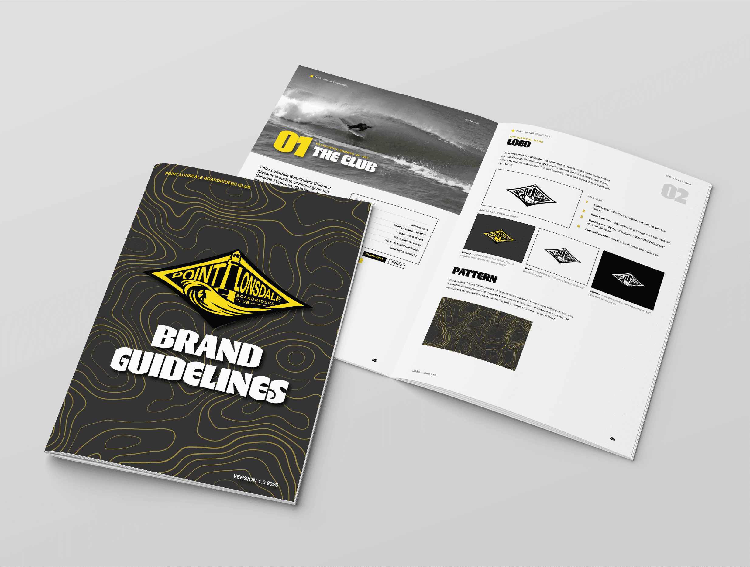
A full brand overhaul for Point Lonsdale Boardriders Club — one of Victoria's oldest surf clubs, established in 1964. The project covered everything from logo design and brand guidelines through to a website, merchandise range, social media templates, and large-format event site signage for the PLBC Aggregate Series competition.




PLBC had no consistent visual identity. The club's existing design was outdated, inconsistently applied, and didn't reflect the scale, culture, or energy of what had grown into one of the Bellarine Peninsula's most active surf clubs. With a 540+ member base and a major annual competition series, the club needed a brand system that could hold up across digital, print, apparel, and a large-scale beach event environment.
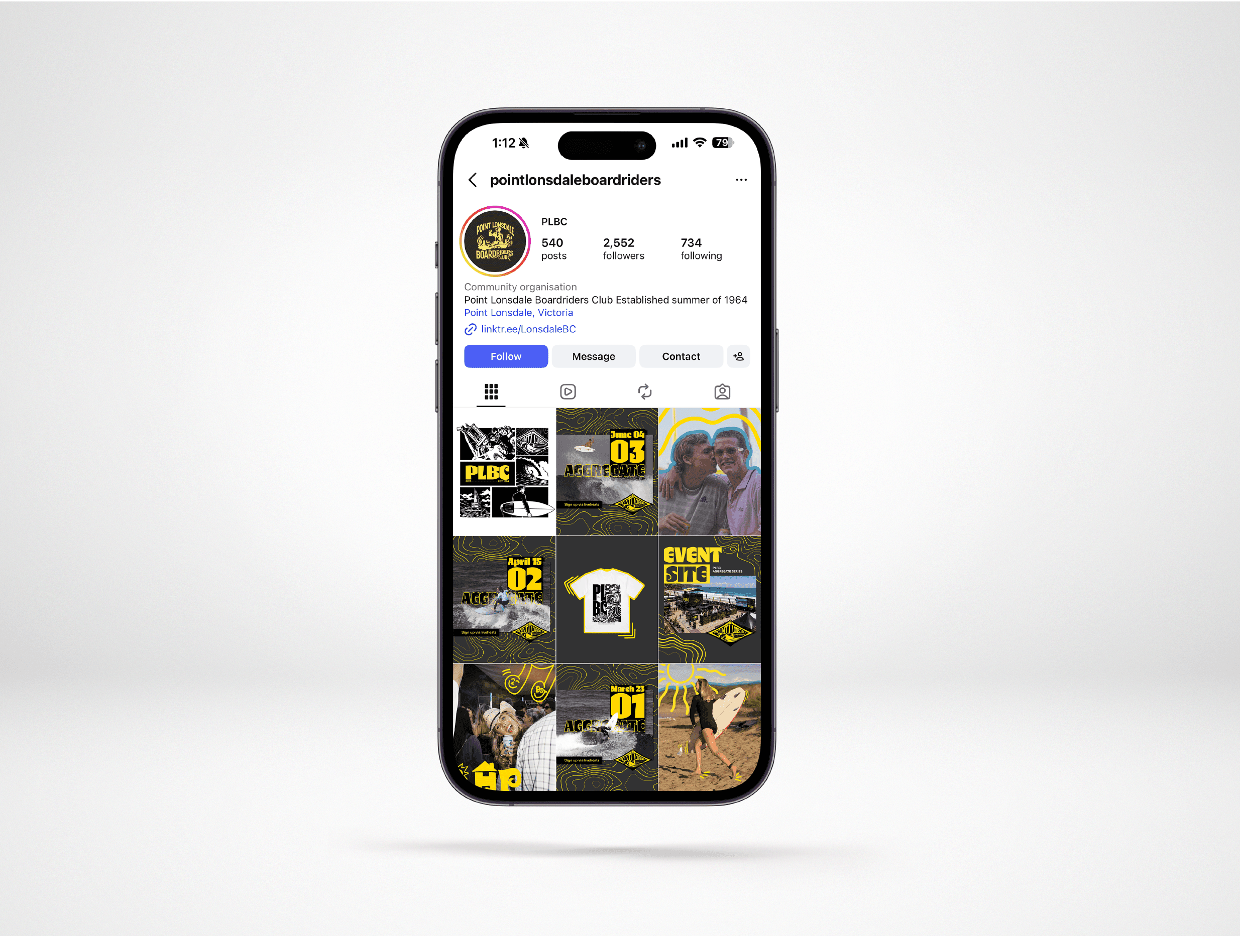
A complete brand rebuild rooted in the club's heritage and location. The new identity centres on a diamond crest logo incorporating the Point Lonsdale lighthouse — the landmark that defines the break — with a surfer in the barrel beneath it. The black and yellow palette runs consistently across every touchpoint: the website, Aggregate Series social posts, hoodies and tees with varied graphic treatments, and large-format event signage. The result is a brand system that looks at home both on a hoodie and on a 6-metre banner at a professional surf contest.

